
Flora Edit Collection
CAPRI BLUE
Role: Creative Concepting, Campaign Direction, On-Set Art Direction, Styling, Launch Framework Implementation
The Context
Capri Blue is widely recognized for its iconic blue jar candles, particularly the Volcano fragrance, its long-standing bestseller and signature scent.
While the brand has expanded into beauty, personal care and home categories, it remains most closely associated with bold, colorful candle design and its long-term retail partnership with Anthropologie.
Historically, Capri Blue’s Anthropologie-exclusive collections have leaned more artful, botanical, and artisan in nature—distinct from the brand’s more saturated, fashion-forward in-line offerings.
Flora Edit marked a strategic shift.

The Challenge
Evolve Capri Blue’s visual and product expression beyond its candle-dominant identity and bold color heritage, introducing a more refined, botanical, and artisan lens within the brand’s own ecosystem.
This launch signaled a move toward:
A more personal care–driven expression
A maturing millennial audience
A deeper embrace of the brand’s namesake roots in the Isle of Capri and Italian craftsmanship
The goal was not to abandon recognition, but to expand it.

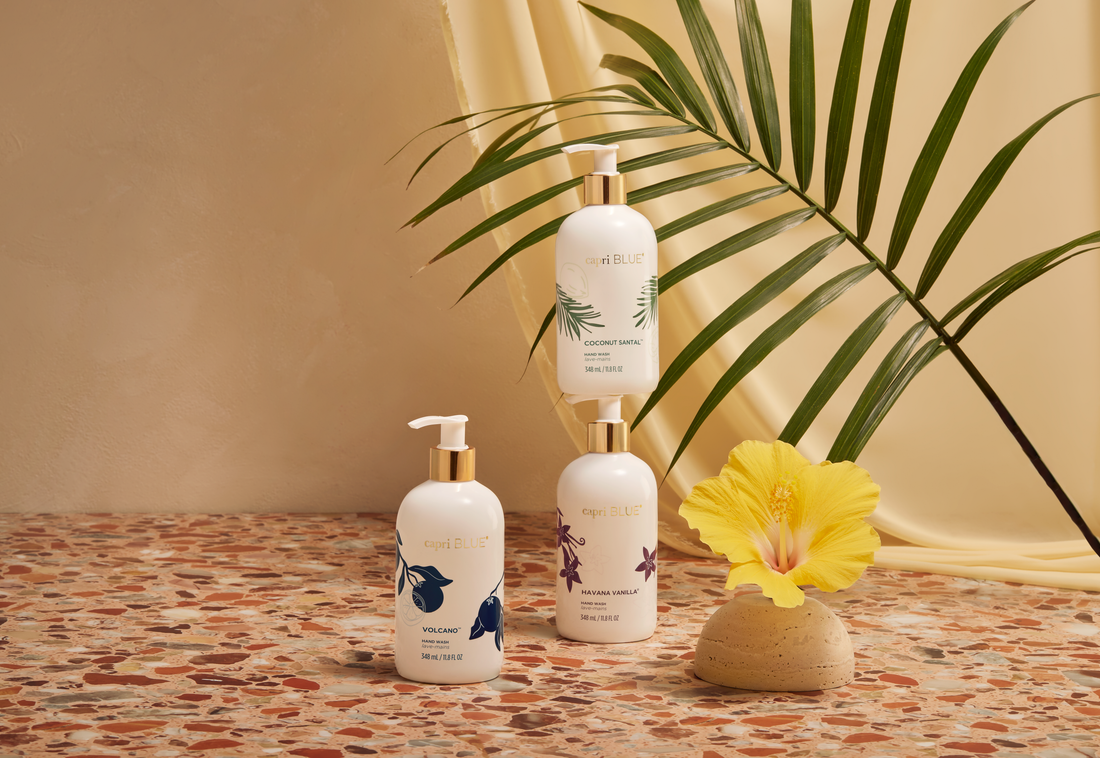
The Creative Direction
Rather than relying on high-saturation color and trend-driven boldness, Flora Edit explored:
Muted, sun-washed palettes
Sculptural botanicals
Layered textures
Compositional restraint
An editorial, art-forward sensibility
The campaign balanced familiarity with evolution, retaining Capri Blue’s vibrancy while introducing a more elevated and artisan-driven aesthetic language.
Execution
Partnered closely with Brand Marketing and Product Development to define both campaign messaging and visual strategy from early concept through launch rollout.
Provided senior creative oversight across:
Hero + lifestyle imagery
Social launch storytelling
Integrated marketing content
Email + ecommerce rollout
Collection-specific visual identity system (color palette, typography, layout direction)
Applied the structured Creative Launch Plan framework to ensure consistency and scalability across all touchpoints. Expanded the brand’s aesthetic vocabulary beyond its core candle identity to support continued category growth.


Impact
Flora Edit successfully repositioned Capri Blue beyond its candle-first perception, demonstrating the brand’s ability to evolve toward a more refined, Italian-inspired, artisan expression while maintaining commercial strength and recognizability.
The collection signaled a maturation of the brand’s visual language and broadened its relevance within beauty and personal care categories.
Achieved 95% wholesale adoption and 99% category adoption at launch
Reached 98% sell-through across channels
Generated 3–4 reorder turns, signaling sustained demand and retail confidence
Validated the collection’s elevated, artisan-forward repositioning within both wholesale and DTC environments.