
Mercury Iridescent Collection
CAPRI BLUE
Role: Creative Concepting, Campaign Direction, Social Strategy Collaboration, Copy Partnership, Launch Framework Development
The Challenge
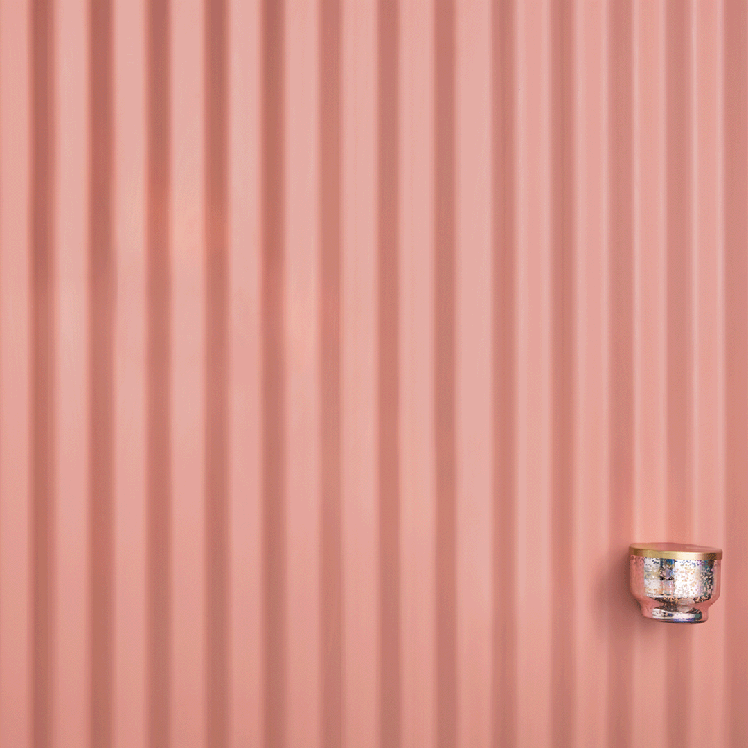
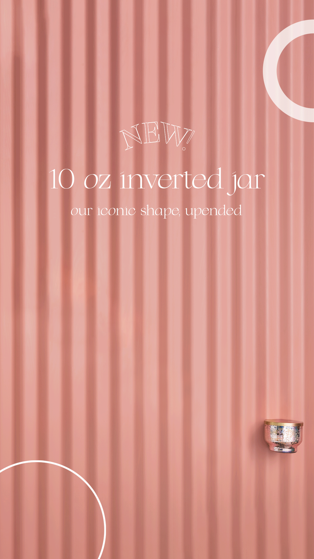
The Mercury Collection was one of Capri Blue’s legacy best-selling collections. The brand sought to evolve the line into a more elevated, trend-forward expression without losing the core equity that made it successful with its new Mercury Iridescent Collection.
At the same time, this launch marked the first implementation of our newly developed Creative Launch Plan framework, requiring a scalable, system-driven approach to asset creation and cross-channel rollout.
The Insight
The opportunity was not to reinvent the Mercury Collection, but to reinterpret it. The updated collection needed to feel refined and trend-aware, balancing timeless metallic finishes with intentional, contemporary color accents that signaled evolution.

The Idea
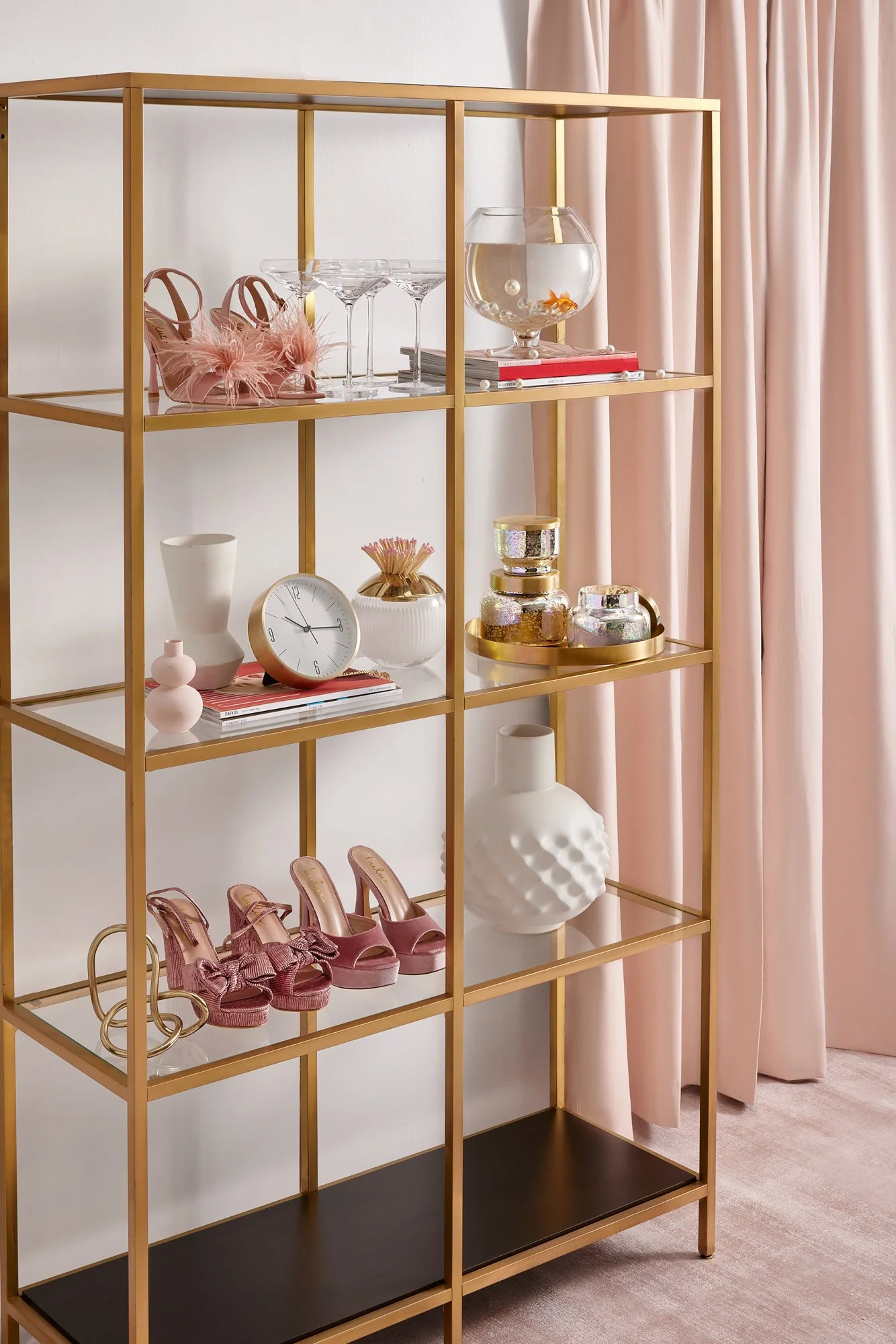
A modernized campaign platform that positioned Mercury Iridescent as a statement object—design-forward, playful, and culturally current, while honoring its best-selling heritage.
Strategic pops of color and unexpected styling moments introduced freshness without disrupting brand recognition.

Execution
Served as senior creative partner across campaign ideation, visual direction, messaging, and social strategy, working closely with Brand Marketing to shape the full narrative ecosystem.
This launch marked the first application of the structured Creative Launch Plan, a comprehensive roadmap outlining asset needs, visual system standards (PMS colors, typography, layouts), and channel deliverables to ensure alignment across marketing, ecommerce, and sales teams.
Oversaw creative execution accross:
Hero + lifestyle imagery
Social content and launch strategy
Integrated marketing + ecommerce rollout
Email and website content
Collection-specific visual identity system


Impact
Achieved 95% wholesale adoption and 99% category adoption at launch
Reached 98% sell-through across channels
Generated 3–4 reorder turns, signaling sustained retail confidence
The campaign successfully elevated a legacy product while driving exceptional commercial performance, validating the brand’s shift toward a more refined, trend-forward creative direction.
